Now use a PostgreSQL client such as psql or pgAdmin to explore the properties of the generated trajectories. We start by obtaining some statistics about the number, the total duration, and the total length in Km of the trips.
SELECT COUNT(*), SUM(duration(Trip)), SUM(length(Trip)) / 1e3
FROM Trips;
-- 1686  "618:34:23.478239"  20546.31859281626
We continue by further analyzing the duration of all the trips
SELECT MIN(duration(Trip)), MAX(duration(Trip)), AVG(duration(Trip))
FROM Trips;
-- "00:00:29.091033"  "01:13:21.225514"  "00:22:02.365486"
or the duration of the trips by trip type.
SELECT
  CASE
    WHEN t.SourceNode = v.Home AND date_part('dow', t.day) BETWEEN 1 AND 5 AND
      date_part('hour', startTimestamp(Trip)) < 12 THEN 'home_work'
    WHEN t.SourceNode = v.Work AND date_part('dow', t.day) BETWEEN 1 AND 5 AND
      date_part('hour', startTimestamp(Trip)) > 12  THEN 'work_home'
    WHEN date_part('dow', t.day) BETWEEN 1 AND 5 THEN 'leisure_weekday'
    ELSE 'leisure_weekend'
  END AS TripType, COUNT(*), MIN(duration(Trip)), MAX(duration(Trip)), AVG(duration(Trip))
FROM Trips t, Vehicles v
WHERE t.VehicleId = v.VehicleId
GROUP BY TripType;
-- "leisure_weekday"    558    "00:00:29.091033"  "00:57:30.195709"  "00:10:59.118318"
-- "work_home"          564    "00:02:04.159342"  "01:13:21.225514"  "00:27:33.424924"
-- "home_work"          564    "00:01:57.456419"  "01:11:44.551344"  "00:27:25.145454"
As can be seen, no weekend leisure trips have been generated, which is normal since the data generated covers four days starting on Monday, June 1st 2020.
We can analyze further the length in Km of the trips as follows.
SELECT MIN(length(Trip)) / 1e3, MAX(length(Trip)) / 1e3, AVG(length(Trip)) / 1e3
FROM Trips;
-- 0.2731400585134866  53.76566616928331  12.200901777206806
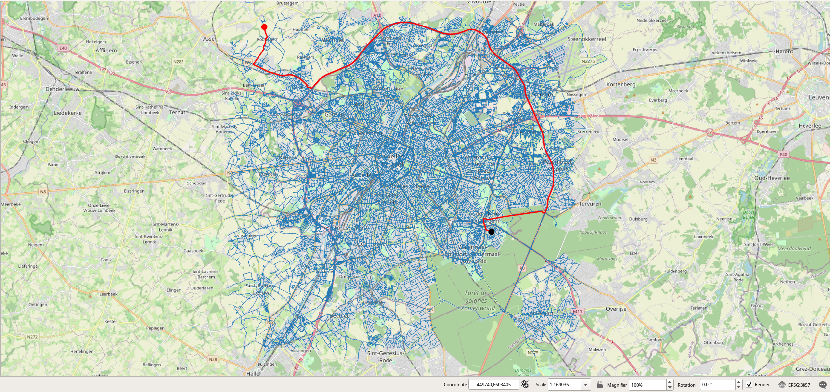
As can be seen the longest trip is more than 56 Km long. Let's visualize one of these long trips.
SELECT VehicleId, SeqNo, source, target, round(length(Trip)::numeric / 1e3, 3),
  startTimestamp(Trip), duration(Trip)
FROM Trips
WHERE length(Trip) > 50000 LIMIT 1;
-- 90  1  23078  11985  53.766  "2020-06-01 08:46:55.487+02"  "01:10:10.549413"
We can then visualize this trip in PostGIS. As can be seen, in Figure 2.1, “Visualization of a long trip.”, the home and the work nodes of the vehicle are located at two extremities in Brussels.
We can obtain some statistics about the average speed in Km/h of all the trips as follows.
SELECT MIN(twAvg(speed(Trip))) * 3.6, MAX(twAvg(speed(Trip))) * 3.6,
  AVG(twAvg(speed(Trip))) * 3.6
FROM Trips;
-- 14.211962789552468  53.31779380411017  31.32438581663778
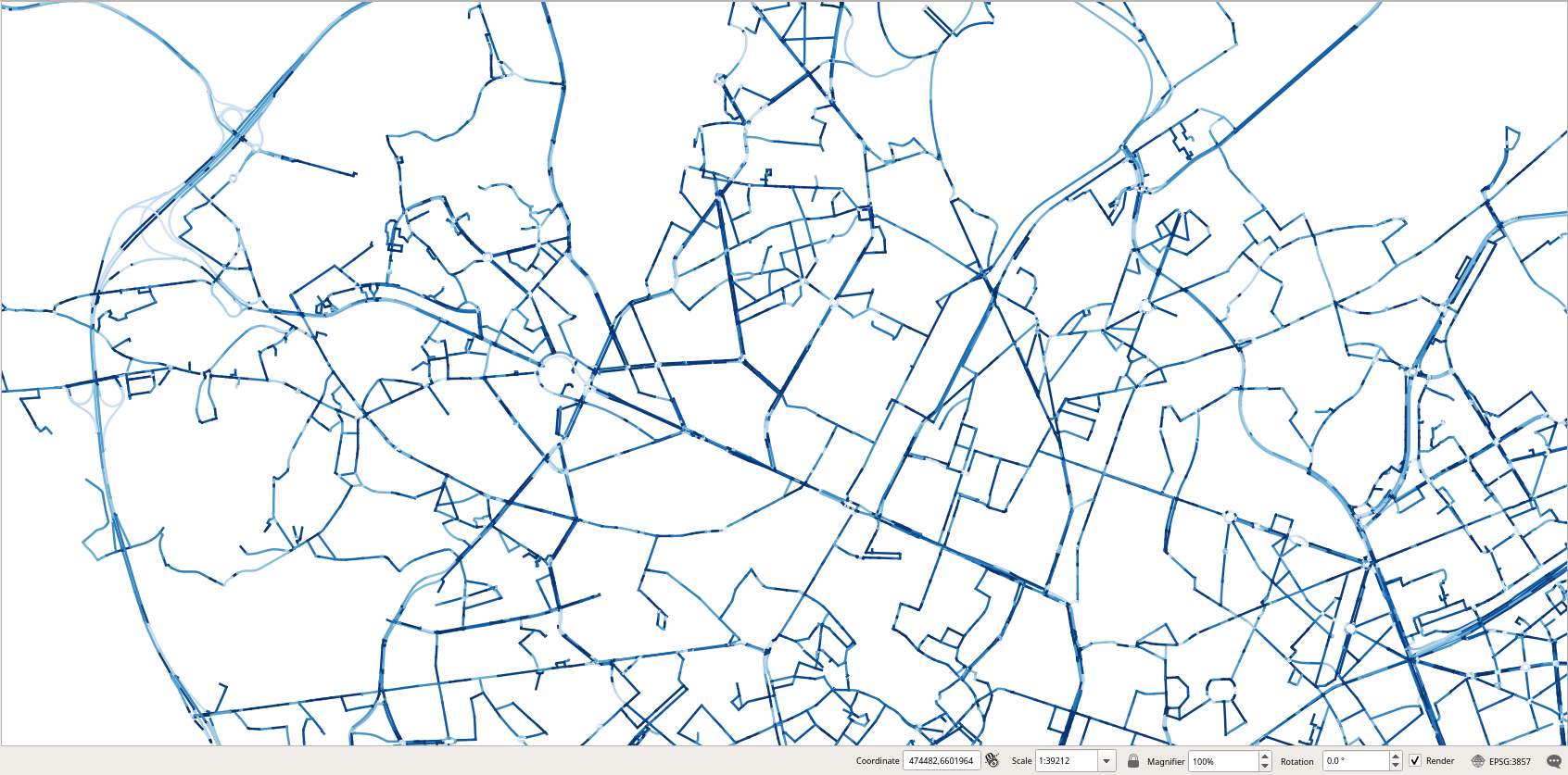
A possible visualization that we could envision is to use gradients to show how the edges of the network are used by the trips. We start by determining how many trips traversed each of the edges of the network as follows.
CREATE TABLE HeatMap AS
SELECT e.id, e.Geom, COUNT(*)
FROM Edges e, Trips t
WHERE ST_Intersects(e.Geom, t.trajectory)
GROUP BY e.id, e.Geom;
This is an expensive query since it took 42 min in my laptop. In order to display unused edges in our visualization we need to add them to the table with a count of 0.
INSERT INTO HeatMap
SELECT e.id, e.Geom, 0 FROM Edges e WHERE e.id NOT IN (
  SELECT id FROM HeatMap );
We need some basic statistics about the attribute COUNT in order to define the gradients.
SELECT MIN(count), MAX(COUNT), round(AVG(COUNT), 3), round(STDDEV(COUNT), 3) FROM HeatMap;
-- 0 204 4.856 12.994
Although the maximum value is 204, the average and the standard deviation are, respectively, around 5 and 13.
In order to display in QGIS the edges of the network with a gradient according to the attribute count, we use the following expression.
ramp_color('RdGy', scale_linear(count, 0, 10, 0, 1))
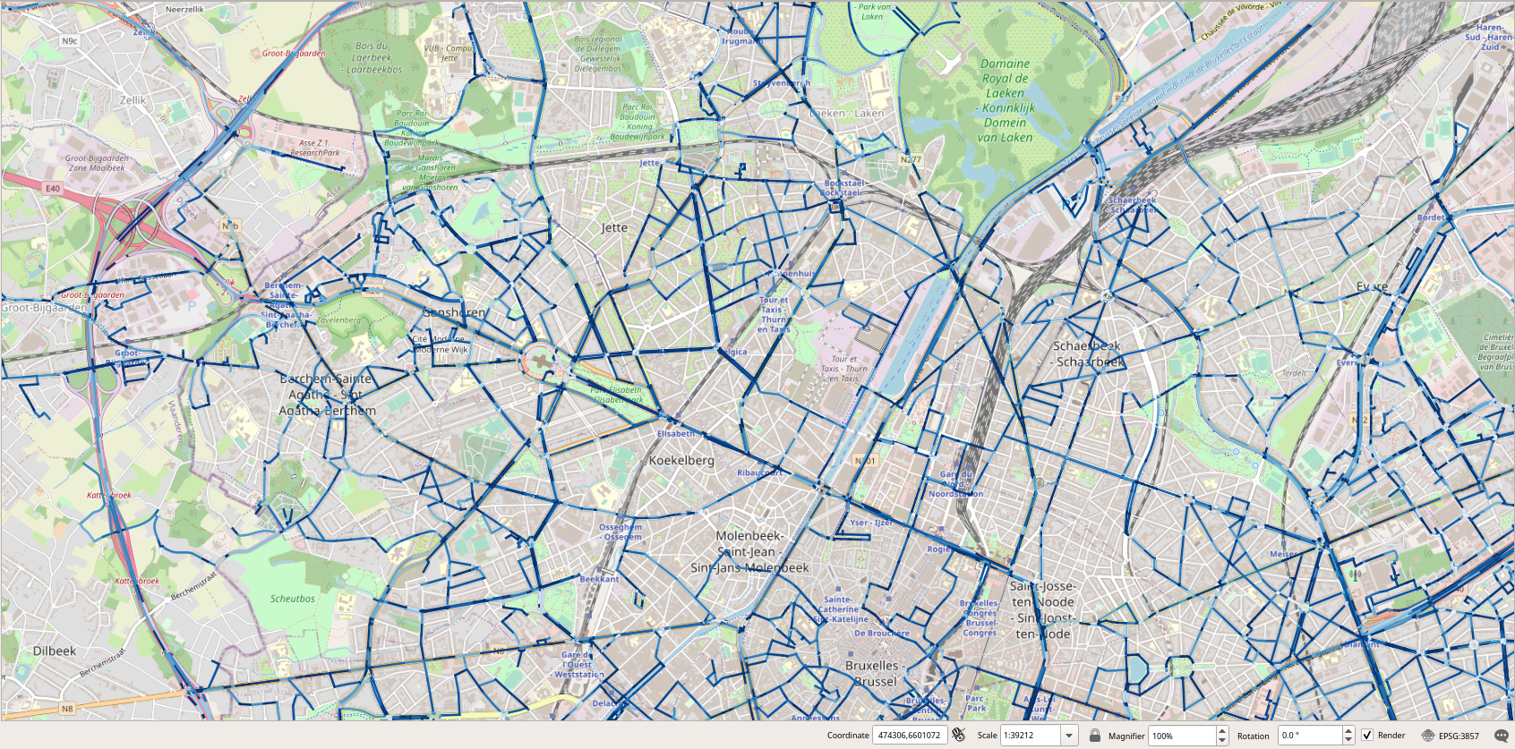
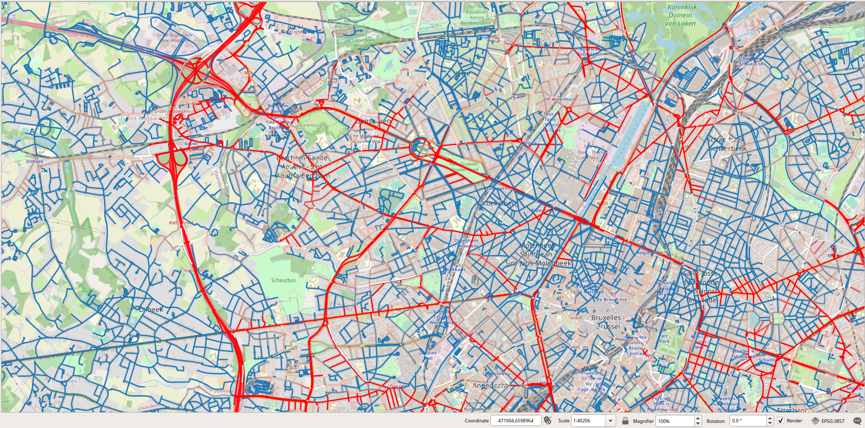
The scale_linear function transforms the value of the attribute count into a value in [0,1], as stated by the last two parameters. As stated by the two other parameters 0 and 10, which define the range of values to transform, we decided to assign a full red color to an edge as soon as there are at least 10 trips that traverse the edge. The ramp_color function states the gradient to be used for the display, in our case from blue to red. The usage of this expression in QGIS is shown in Figure 2.2, “Assigning in QGIS a gradient color from blue to red according to the value of the attribute count.” and the resulting visualization is shown in Figure 2.3, “Visualization of the edges of the graph according to the number of trips that traversed the edges.”.
Figure 2.2. Assigning in QGIS a gradient color from blue to red according to the value of the attribute count.
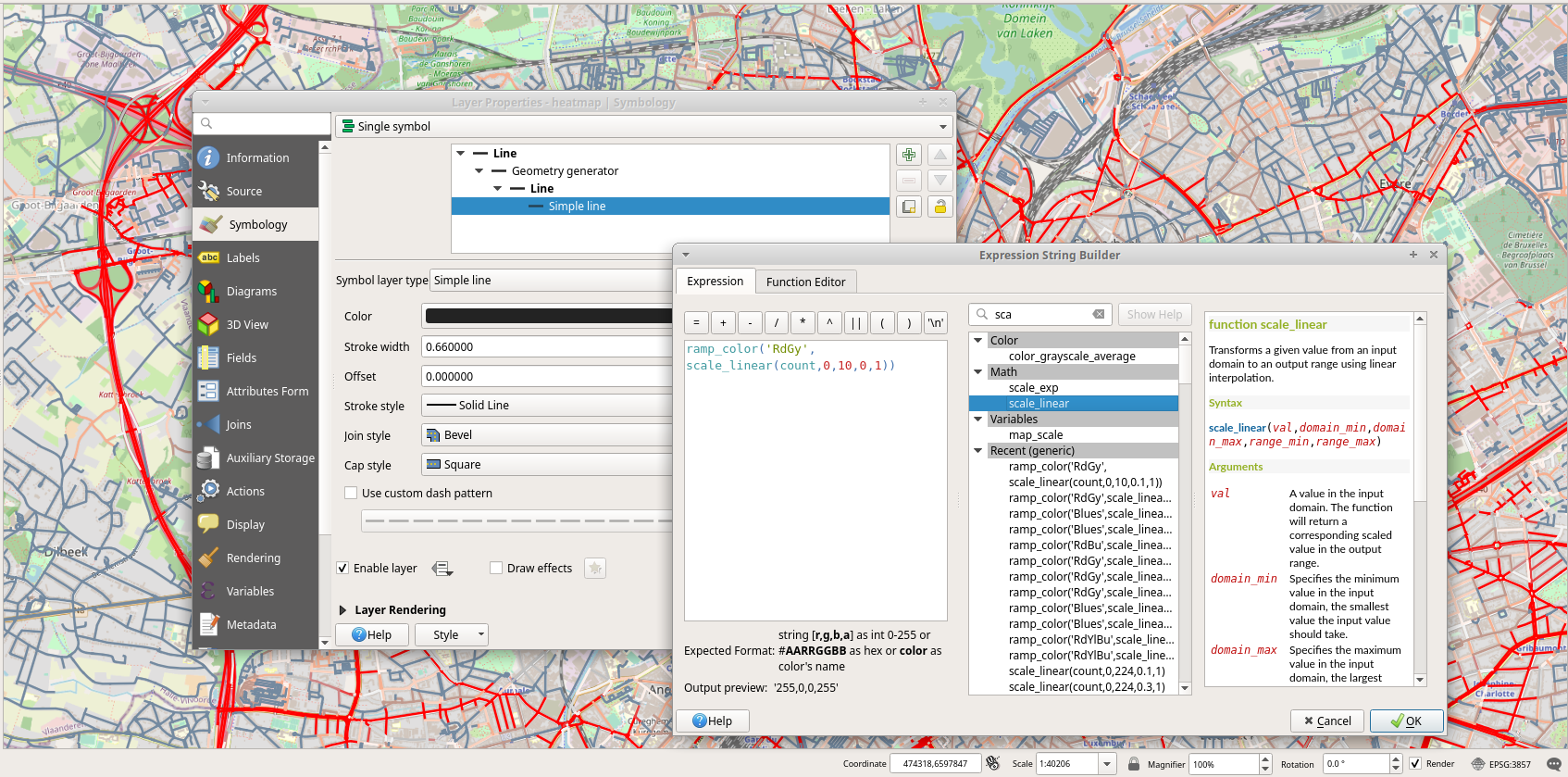
Figure 2.3. Visualization of the edges of the graph according to the number of trips that traversed the edges.
Another possible visualization is to use gradients to show the speed used by the trips to traverse the edges of the network. As the maximum speed of edges varies from 20 to 120 Km/h, what would be interesting to compare is the speed of the trips at an edge with respect to the maximum speed of the edge. For this we issue the following query.
DROP TABLE IF EXISTS EdgeSpeed;
CREATE TABLE EdgeSpeed AS
SELECT p.edge, twAvg(speed(atGeometry(t.Trip, ST_Buffer(p.Geom, 0.1)))) * 3.6 AS twAvg
FROM Trips t, Paths p
WHERE t.source = p.start_vid AND t.target = p.end_vid AND p.edge > 0
ORDER BY p.edge;
This is an even more expensive query than the previous one since it took more than 2 hours in my laptop. Given a trip and an edge, the query restricts the trip to the geometry of the edge and computes the time-weighted average of the speed. Notice that the ST_Buffer is used to cope with the floating-point precision. After that we can compute the speed map as follows.
CREATE TABLE SpeedMap AS
WITH Temp AS (
  SELECT edge, avg(twAvg) FROM EdgeSpeed GROUP BY edge )
SELECT id, maxspeed_forward AS maxspeed, Geom, avg, avg / maxspeed_forward AS perc
FROM Edges e, Temp t
WHERE e.id = t.edge;
Figure 2.4, “Visualization of the edges of the graph according to the speed of trips that traversed the edges.” shows the visualization of the speed map without and with the base map.