With the dashboard configured, and a datasource added, we can now build different panels to visualize data in intuitive ways.
Let's visualize the speed of the ships using the previously built query. Here we will represent it as a statistic with a color gradient.
Add a new panel
Select DanishAIS as the data source
In Format as, change
Time seriestoTableand chooseEdit SQLHere you can add your SQL queries. Let's replace the existing query with the following SQL script:
SELECT MMSI, ABS( twavg(SOG) * 1.852 - twAvg( speed(Trip))* 3.6 ) AS SpeedDifference
FROM Ships
ORDER BY SpeedDifference DESC
LIMIT 5;
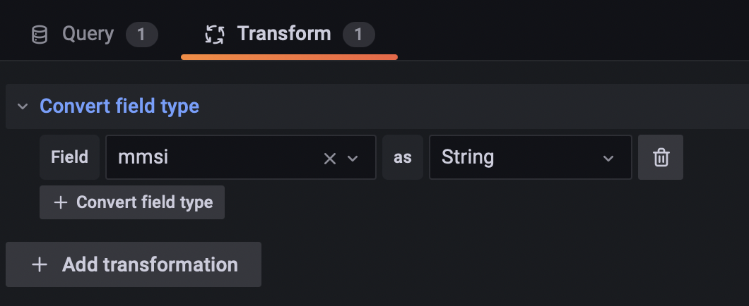
We can also quickly do some datatype transformations to help Grafana correctly interpret the incoming data. Next to the Query button, select
Transform, addConvert field typeand choose mmsi as String.We will modify some visualization options in the panel on the right.
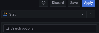
First, choose stat as the visualization
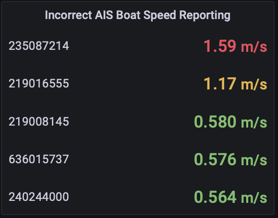
Panel Options: Give the panel the title Incorrect AIS Boat Speed Reporting
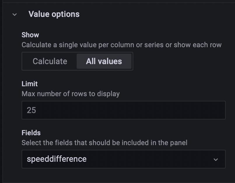
Value Options:
Note: we can include a limit here instead of in our SQL query as well.
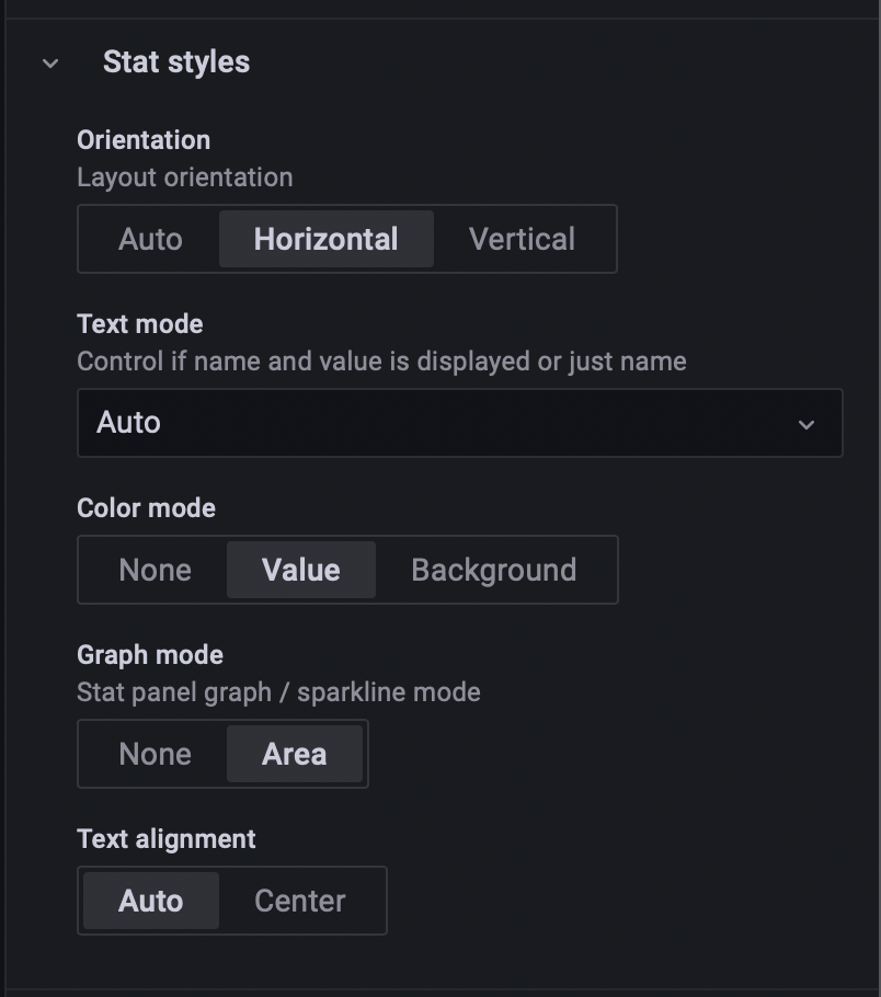
Stat Styles:
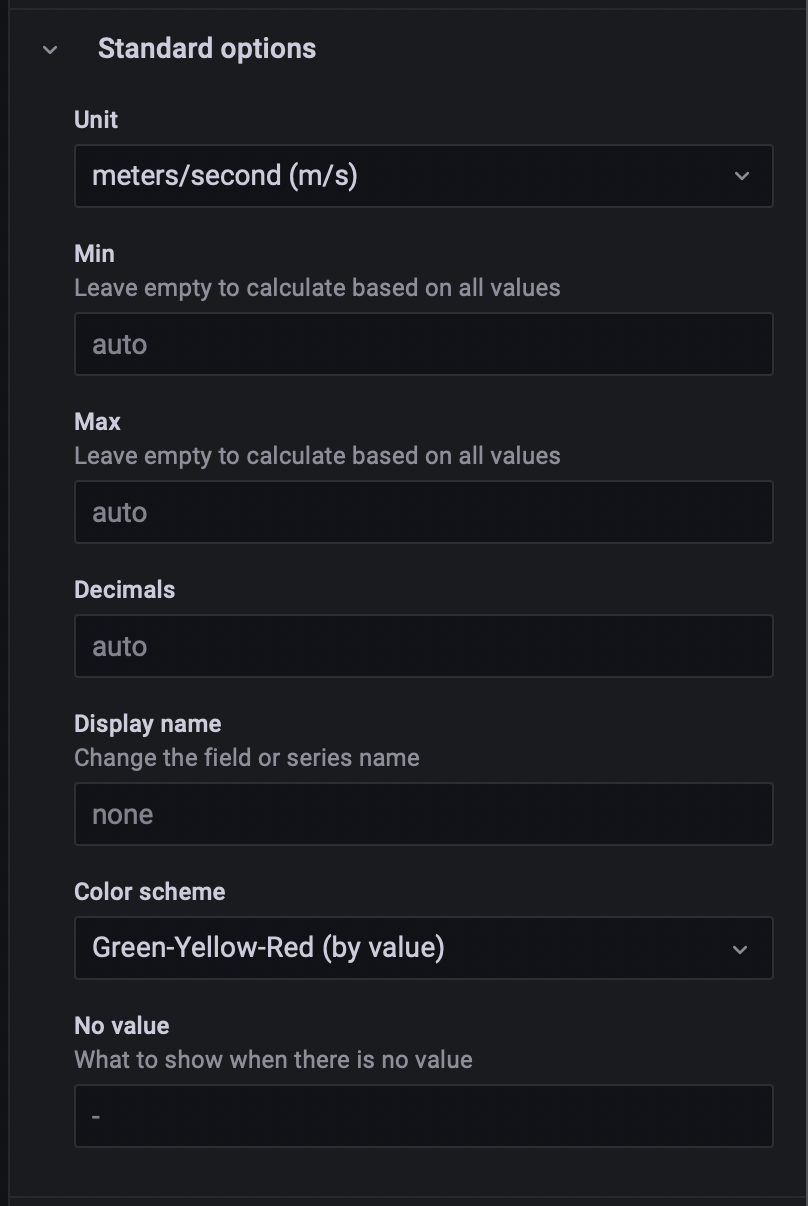
Standard Options:
Unit: Velocity → meter/second (m/s). Note: you can scroll in the drop-down menu to see all options.
Color scheme: Green-Yellow-Red (by value)
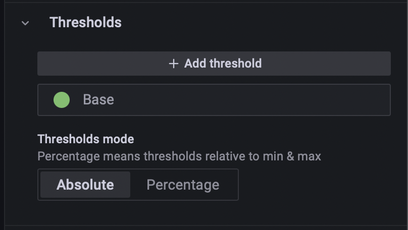
Thresholds:
remove the existing threshold by clicking the little trash can icon on the right. Adding a threshold will force the visualization to color the data a specific color if the threshold is met.
The final visualization will look like the screenshot below.
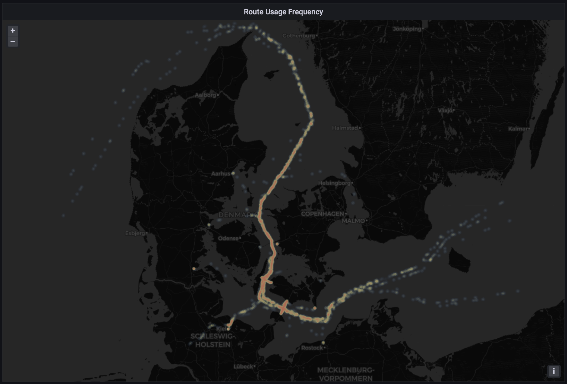
We can visualize the routes used by ships with a heat map generated from individual GPS points of the ships. This approach is quite costly, so we will use TABLESAMPLE SYSTEM to specify an approximate percentage of the data to use. If the frequency of locations returned varies in different areas, a heatmap using individual datapoints could be misleading without further data pre-processing. An alternative approach could be to use the PostGIS function ST_AsGeoJSON to generate shapes in geoJSON format which can be used in Grafana's World Map Panel plugin.
Add a panel, select DanishAIS as the data source and Format As Table.
Using Edit SQL, add the following SQL code:
-- NOTE: TABLESAMPLE SYSTEM(40) returns ~40% of the data.
SELECT latitude, longitude, mmsi
FROM aisinputfiltered TABLESAMPLE SYSTEM (40)
Change the visualization type to Geomap.
On the map, zoom in to fit the data points into the frame and modify the following visualization options:
Panel Options:
Title: Route Usage Frequency
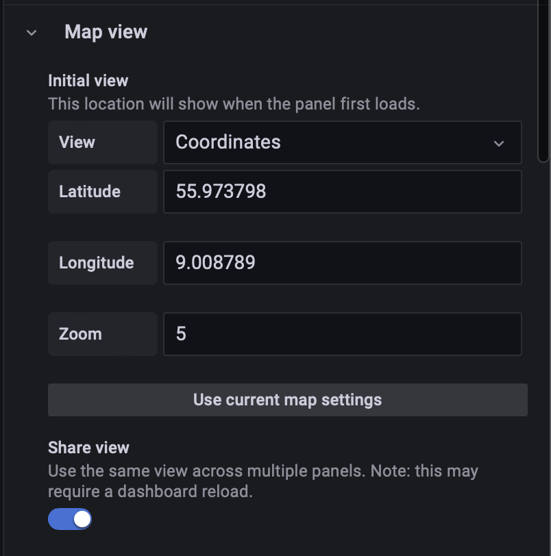
Map View:
Use current map setting (this will use the current zoom and positioning level as default)
Share View: enable (this will sync up the movement and zoom across multiple maps on the same dashboard)
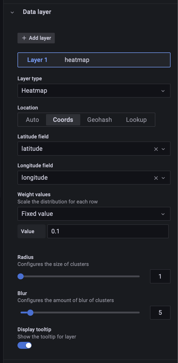
Data Layer:
Layer type: Heatmap
Location: Coords
Latitude field: latitude
Longitude field: longitude
Weight values: 0.1
Radius: 1
Blur: 5
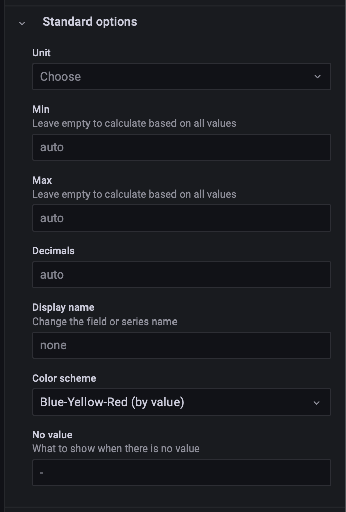
Standard Options:
Color scheme: Blue-Yellow-Red (by value).
The final visualization will look like the screenshot below.
Note: The number of datapoints rendered can be manipulated by changing the parameter of the TABLESAMPLE SYSTEM() call in the query.
Create a new panel, and set DanishAIS as the Source, Format as:
Table.Select visualization as:
GeomapAdd this SQL in the
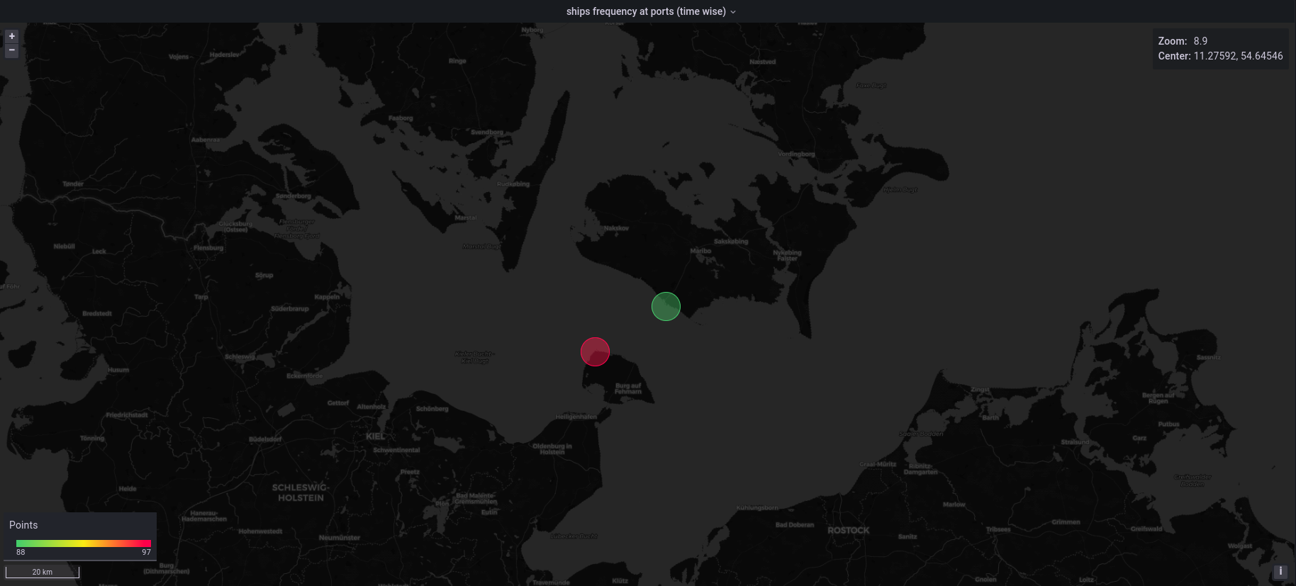
SQL editorsection-- Table with bounding boxes over regions of interest WITH ports(port_name, port_geom, lat, lng) AS ( SELECT p.port_name, p.port_geom, lat, lng FROM (VALUES -- ST_MakeEnvelope creates geometry against which to check intersection ('Rodby', ST_MakeEnvelope( 651135, 6058230, 651422, 6058548, 25832)::geometry, 54.53, 11.06), ('Puttgarden', ST_MakeEnvelope( 644339, 6042108, 644896, 6042487, 25832)::geometry, 54.64, 11.36)) AS p(port_name, port_geom, lat, lng)) -- p.lat and p.lng will be used to place the port location on the visualization SELECT P.port_name, sum(numSequences(atGeometry(S.Trip, P.port_geom))) AS trips_intersect_with_port, p.lat, p.lng FROM ports AS P, Ships AS S WHERE eIntersects(S.Trip, P.port_geom) GROUP BY P.port_name, P.lat, P.lngNote: You will see queries are build using the WITH statement (common table expressions - CTE). This helps to break the query down into parts, and also helps make it easier to understand by others.
The options (visualization settings - on the right side of the screen) should be as follows:
Data Layer
Layer type: →
markersStyle Size: →
Fixedand value: 20Color: →
trips_intersect_with_port(This will color points on the map based on this value)
Standard options
Min → 88
Max → 97
Color scheme →
Green-Yellow-Red (by value)
Note: At the writing of this tutorial, the Geomap plugin is in beta and has some minor bugs with how colors are rendered based when the
MinandMaxvalues are auto calculated.
In the visualization below we can see port Rodby has a higher number of ships coming and going to it and that's why it is colored red. This visualization can show relative activity of ships in regions and ports.
Follow the similar steps to add a Geomap panel as before, we include the following SQL script:
WITH TimeShips(MMSI, Trip) AS (
  SELECT MMSI,
    atTime(Trip, tstzspan '[2018-01-04 01:00:00, 2018-01-04 06:30:00)' )
  FROM Ships ),
TimeClosestShips(Boat1, Boat2, closestDistance, timeAtClosestDist, tripB1, tripB2) AS (
  SELECT S1.MMSI, S2.MMSI,
    startValue(atMin(S1.trip <-> S2.trip)),
    startTimestamp(atMin(S1.trip <-> S2.trip)),
    S1.trip AS tripB1, S2.trip
  FROM TimeShips S1, TimeShips S2
  WHERE S1.MMSI > S2.MMSI AND edwithin(S1.Trip, S2.Trip, 300) )
SELECT t.boat1, t.boat_2, t.closet_distance, t.timeAtClosestDist,
  ST_X(ST_Transform(valueAtTimestamp(tripB1, timeAtClosestDist), 4326) ) AS b1_lng,
  ST_Y(ST_Transform(valueAtTimestamp(tripB1, timeAtClosestDist), 4326) ) AS b1_lat,
  ST_X(ST_Transform(valueAtTimestamp(tripB2, timeAtClosestDist), 4326) ) AS b2_lng,
  ST_Y(ST_Transform(valueAtTimestamp(tripB2, timeAtClosestDist), 4326) ) AS b2_lat
FROM TimeClosestShips t;
We explain next the above query. The TimeShips CTE returns the data for a time period from 1 am to 6:30 am The TimeClosestShips CTE returns the time, location, and closest distance of the boats that are within 300 m of each other. Note the use of dWithin in the WHERE clause improves performance by limiting the computation to only those ships that were within 300 m. The final SELECT is used to project the timeAtClosestDistance onto the sequence of locations to return the lat and long of both ships.
To add the points to the map modify the following options:
Panel Options:
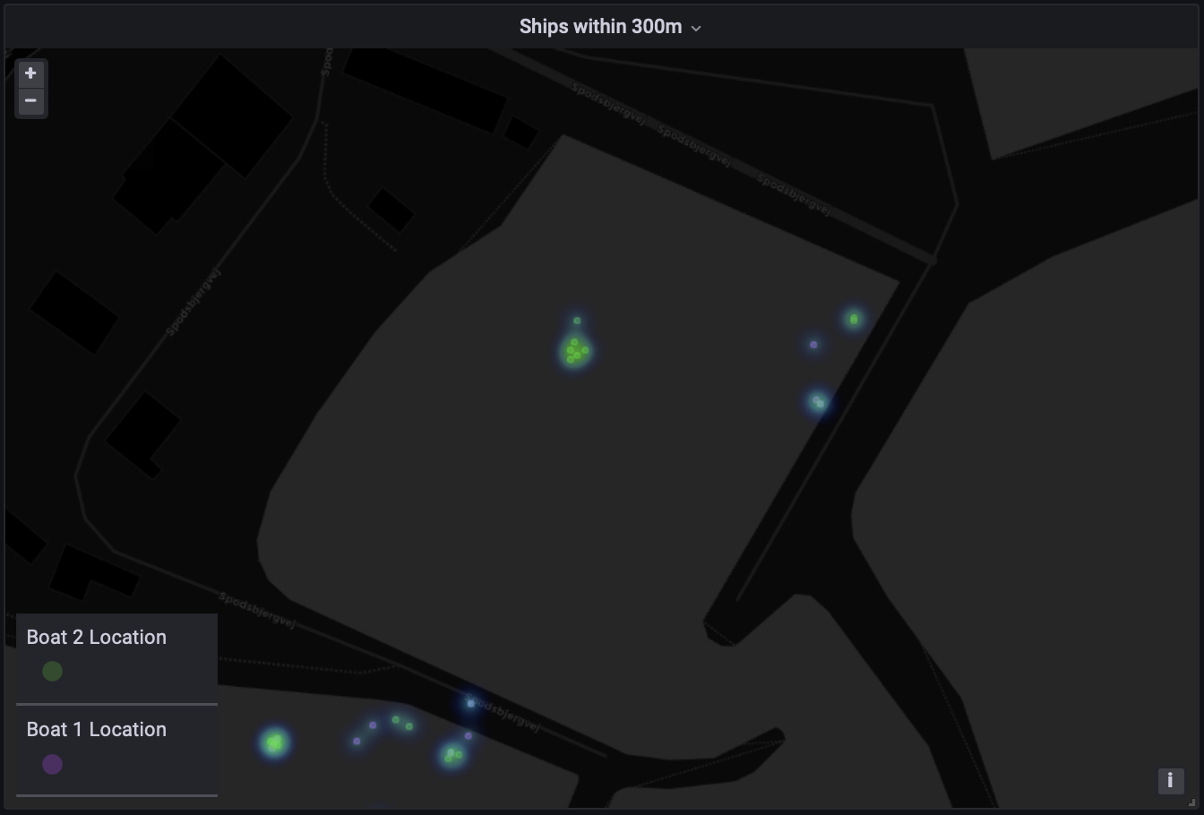
Title: Ships within 300m
Map View:
Share view: enabled
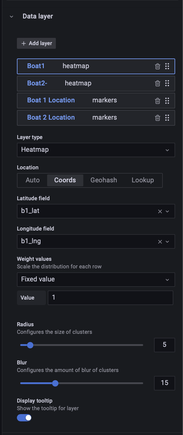
Data Layer:
Layer 1: rename to Boat1
Layer type: Heatmap
Location: Coords
Latitude field: b1_lat
Longitude field: b1_lng
Radius: 5
Blur: 15
Click on + Add layer to add another heat map layer to the data, this time using b2_lat and b2_long as the coordinates. We can also add a layer to show the precise locations with markers for both ships (using b1_lat, b1_lng, b2_lat and b2_long), setting each marker to a different color. For the Boat 1 and Boat 2 Locations, we use the following options:
Data Layer:
Value: 1
Color: select different color for each boat.
The final visualization looks like the below.
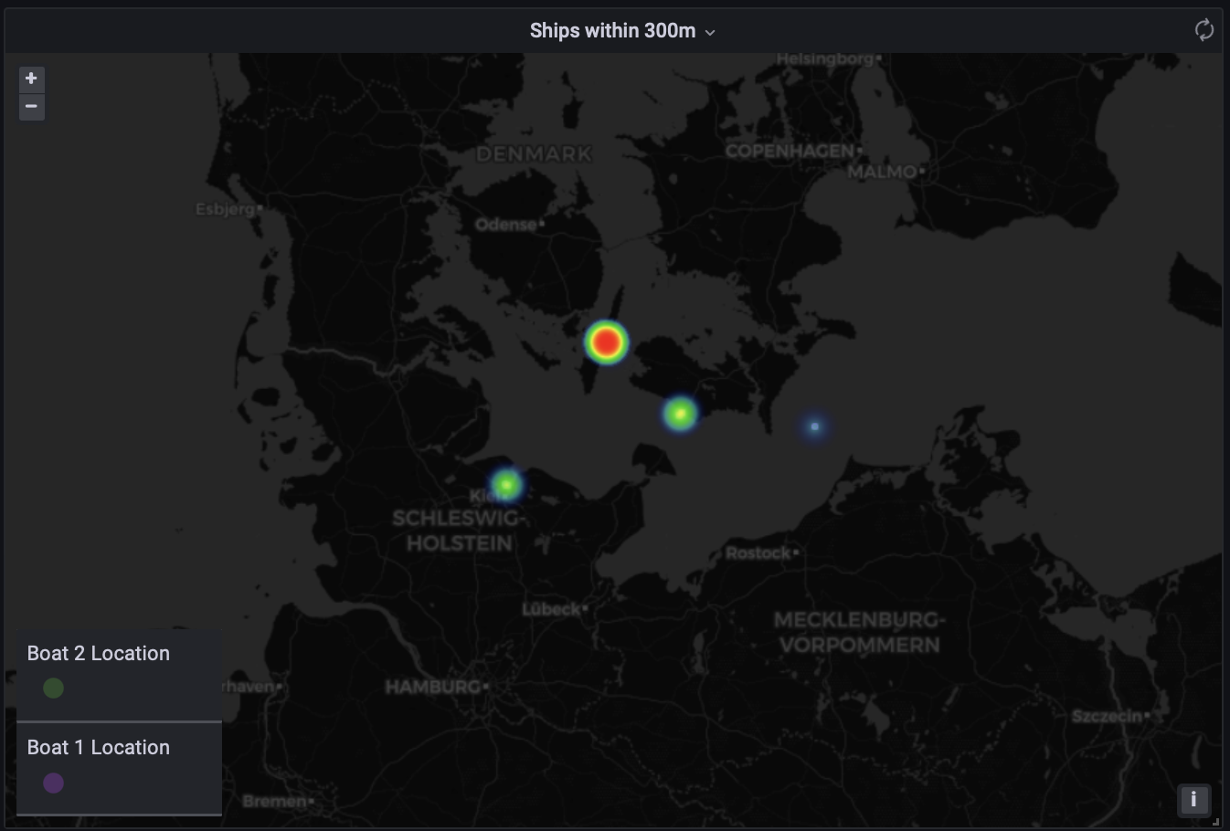
It's helpful to include the tooltip for layers to allow users to see the data behind the visualization, which helps in interpretation and is a good way for subject-matter-experts to provide concrete feedback. Using the tooltip, we can quickly see that the same ship can be within 300m to multiple other ships in the same time frame (as seen in the screenshot below). This can result in a higher frequency of results in a heat map view than expected. SQL queries should be modified to ensure they are correctly interpreted.
Not surprisingly, we see there are lots of results for proximity within ports. We could avoid including results in ports by excluding all results that occur within envelopes defined by ST_MakeEnvelope, as seen in the previous queries.